
California isn’t just another state—it’s the state where first impressions can literally make or break your business. Think about it: people here are spoiled for choice. You’ve got tech giants up in Silicon Valley, trendsetters in Los Angeles, surf shops in San Diego, wine country up north… and then there’s you, trying to stand out in all that noise.
And here’s the truth: most Californians won’t give your business a second chance if your website feels old, clunky, or just plain boring. That’s where California web design steps in. Done right, your site becomes your loudest, proudest salesperson, 24/7. Done wrong? Well, let’s just say nobody’s waiting around for your homepage to load while they’re sipping a $7 oat milk latte in LA.
So, what do people here secretly judge about your website? A lot, actually. But don’t worry—I’ve narrowed it down to the 7 big things Californians notice right away (even if they won’t tell you to your face). Fix these, and you’ll already be miles ahead of half your competition.
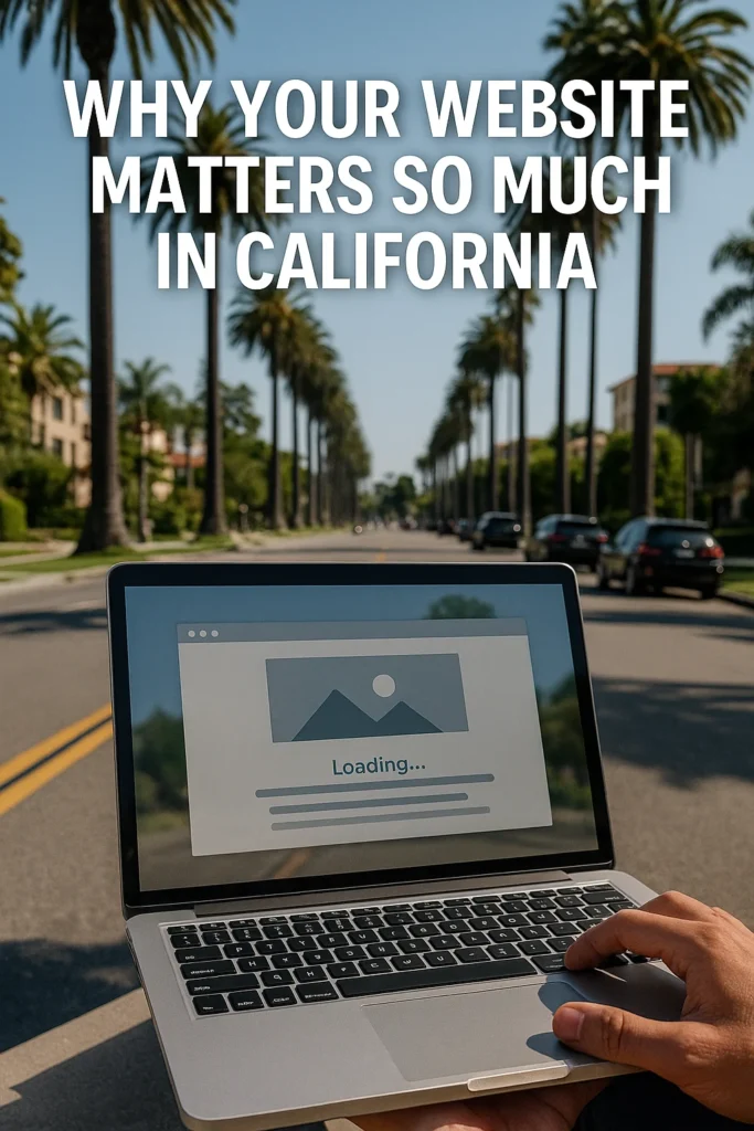
Why Your Website Matters So Much in California
Look, here’s the thing about doing business in California: competition is absolutely insane. You’re not just competing with the shop down the street—you’re competing with brands that have million-dollar marketing budgets, slick design teams, and entire armies running their social media. People here are used to high standards, and that means your website can’t just be “good enough.”
Competition Is Wild Out Here
Take Los Angeles, for example. Every street has five coffee shops, three gyms, and a handful of boutiques trying to look cooler than the next one. If your website doesn’t instantly grab attention, you’re forgotten. In San Francisco or Silicon Valley, if your site looks outdated, people assume your entire business is outdated too. That’s how fast judgment happens here.
First Impressions Stick
Californians are busy. They’re sitting in traffic, juggling three side hustles, or scrolling while waiting in line at In-N-Out. If your site doesn’t load fast, isn’t mobile-friendly, or looks messy, they’re gone. No second chances. The harsh truth? In California, your website is your first impression—and often your only one.
Why “California Web Design” Isn’t Just Buzzwords
Here’s the real kicker: California web design isn’t just about looking pretty. It’s about creating a vibe that feels right for the people here. Sleek and modern for the tech crowd up north, bold and trendy for the LA scene, chill and nature-inspired for coastal towns like Santa Cruz or Santa Barbara. If your site doesn’t reflect that local flavor, it just feels… generic. And generic won’t cut it here.
Bottom Line
Your website matters in California because people have options. Tons of them. And they’re picky. If your site doesn’t make a killer first impression, you’re basically handing business over to the next guy.
👉 Next up, we’ll get into the first thing Californians secretly judge about your website: How Fast It Loads. Spoiler: nobody here has patience for a slow homepage.
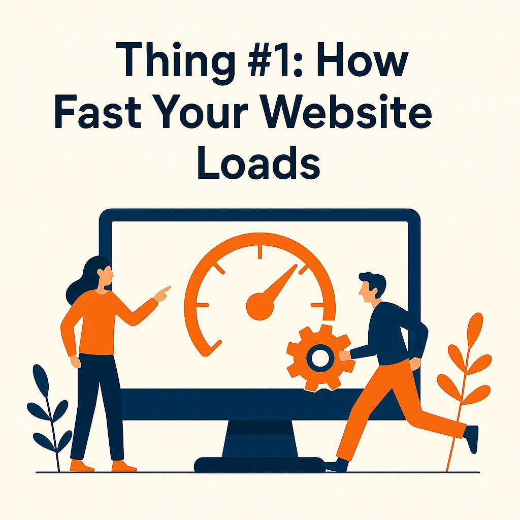
Thing #1: How Fast Your Website Loads
Here’s the deal: nobody in California is waiting around for a slow website. People are already stuck in traffic on the 405, waiting 45 minutes just to move a few miles—they’re not about to waste another 10 seconds watching your homepage crawl into existence.
Speed matters. Big time.
Speed = Respect
When your site loads instantly, it shows you respect your visitors’ time. If it doesn’t? It feels sloppy, like you don’t really care. Californians pick up on that energy. And trust me, they’ll bounce faster than you can say “Hollywood Boulevard.”
The Numbers Don’t Lie
Studies show that if a site takes more than 3 seconds to load, half your visitors leave. That’s brutal. And in California, where people are juggling multiple gigs, apps, and notifications every minute, patience is even shorter.
What’s Slowing You Down?
- Huge, uncompressed images (your homepage doesn’t need billboard-size photos)
- Too many fancy animations nobody asked for
- Cheap hosting that can’t handle traffic spikes
Fix those, and your site instantly feels smoother.
The California Standard
Think about the companies setting the bar here: Apple, Google, Tesla. Their websites are lightning fast. Even if you’re a small bakery in Santa Monica, people subconsciously compare your site’s performance to those giants. It’s not fair, but it’s real.
⚡ Bottom line: in California, a slow site = a dead site. If you want locals to stick around, make sure your site loads faster than an iced coffee order at Starbucks.
👉 Next up: Thing #2: How It Looks on a Phone. Because let’s be honest—most Californians basically live on their mobiles.
Thing #2: How It Looks on a Phone
Let’s be real—Californians basically live on their phones. From Venice Beach to Silicon Valley, everyone’s scrolling, swiping, and shopping on mobile. If your site looks great on a laptop but falls apart on a phone, you’ve already lost half your audience.
Mobile Is the Main Event
Over 65% of web traffic in California comes from mobile devices. Whether it’s someone ordering tacos in San Diego or checking salon hours in Oakland, they’re doing it on their phone. If your site isn’t responsive—meaning it adapts perfectly to different screen sizes—you’re toast.
What Drives Californians Crazy on Mobile
- Tiny fonts that make people zoom in (instant turn-off).
- Menus that are impossible to tap without fat-fingering.
- Pop-ups that block the whole screen.
- Slow load times on mobile data.
People here won’t stick around to fight your clunky design. They’ll just click the next option in Google.
Mobile-First = Respect for Users
Good California web design means thinking mobile-first. That’s not just resizing your desktop site—it’s reimagining it for small screens. Simple navigation, easy-to-read text, clickable buttons, and fast-loading visuals. If you make it effortless, users stay.
Local Example
Picture this: someone in LA is looking for a brunch spot. They’re walking, phone in hand, sun in their eyes. They click your site. If it takes too long to load, or they can’t even find your menu because it’s hidden under some weird drop-down? Bye. They’re off to your competitor down the street.
⚡ Bottom line: In California, if your site doesn’t shine on mobile, it doesn’t shine at all.
Thing #3: Whether Your Branding Feels Authentic
Here’s the thing about Californians: they can smell fake from a mile away. In LA, everyone’s seen enough “perfect” to know when something feels off. Up north in San Francisco, people value authenticity and transparency more than flashy gimmicks. So if your website branding feels generic, stiff, or disconnected, people here won’t trust it.
Californians Want the Real You
It doesn’t matter if you run a taco truck in East LA, a surf shop in Santa Cruz, or a startup in Palo Alto—your brand has to feel real. Overly polished, cookie-cutter designs give off the wrong vibe. Instead, your site should reflect your actual story, your personality, and your values.
Signs Your Branding Feels “Fake”
- Using the same stock photos everyone else uses.
- Buzzword overload (“We’re innovative, scalable, world-class…” yeah, okay).
- A logo and color palette that look like they came from a $5 template.
Californians want to see your people, your products, your community. Not some random guy in a suit shaking hands.
Local Flavor Makes It Click
Think about it—LA has that bold, edgy vibe. San Diego is laid-back and beachy. Silicon Valley? Sleek and minimal. Your website should reflect the local culture your audience connects with. That’s what makes your brand feel grounded, not generic.
Keep It Consistent
Authenticity doesn’t mean sloppy. If your fonts, colors, and messaging feel all over the place, users won’t know what to think. Consistency across pages (and across your socials) tells visitors you’re professional and trustworthy.
⚡ Bottom line: In California, being authentic isn’t just a branding choice—it’s survival. People here can tell if you’re trying too hard. Keep it real, and they’ll stick with you.

Thing #4: Your Visual Vibe
California isn’t just a place—it’s a whole mood. People here are surrounded by beautiful sunsets, palm trees, beaches, tech campuses, art scenes, and movie sets. That means your website’s look and feel—its visual vibe—matters more than you think.
Colors Speak Louder Than Words
Colors aren’t just decoration; they set the tone.
- LA vibe → bold colors, trendy fonts, high-energy visuals.
- San Diego vibe → chill tones, ocean blues, clean white space.
- NorCal vibe → earthy greens, minimal design, nature-inspired imagery.
If your website vibe feels like it could belong anywhere, you’re already losing. Locals want something that reflects here.
Photos That Actually Connect
Stock photos? Boring. Californians see right through them. Use real images—your team, your products, your actual neighborhood. For example, if you’re a Venice Beach surf shop, show the boardwalk, not some random beach in Florida.
Fonts, Layout, Energy
Your font choices, spacing, and layout all tell a story. Tight, minimal layouts might appeal to techies in Palo Alto. Bigger, bolder design fits LA fashion brands. The key? Your visual vibe has to match your audience’s energy.
Why This Matters
People make snap judgments based on how your site looks. In California, where trends shift fast and competition is intense, those first visual cues can mean instant trust—or instant bounce.
⚡ Bottom line: Your visual vibe needs to say, “Yeah, we get California.” If it feels off, people won’t stick around.
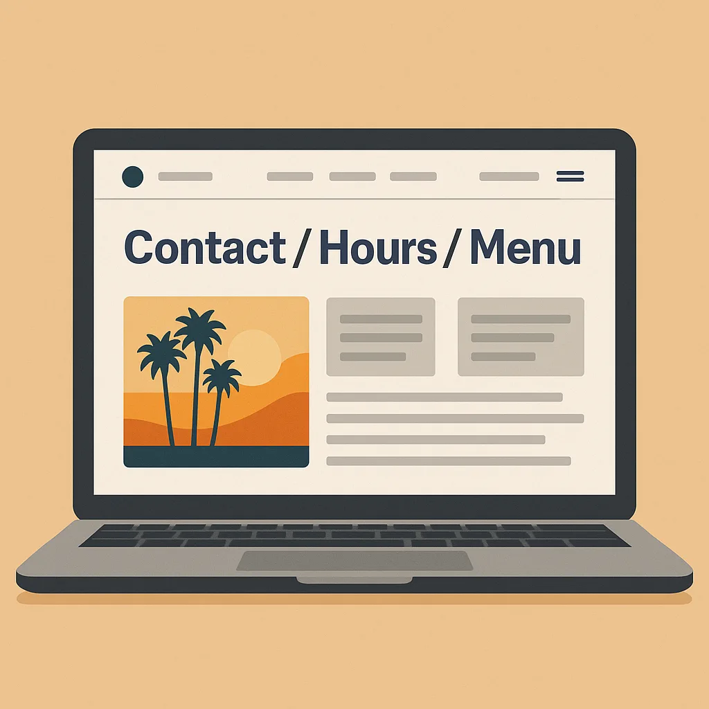
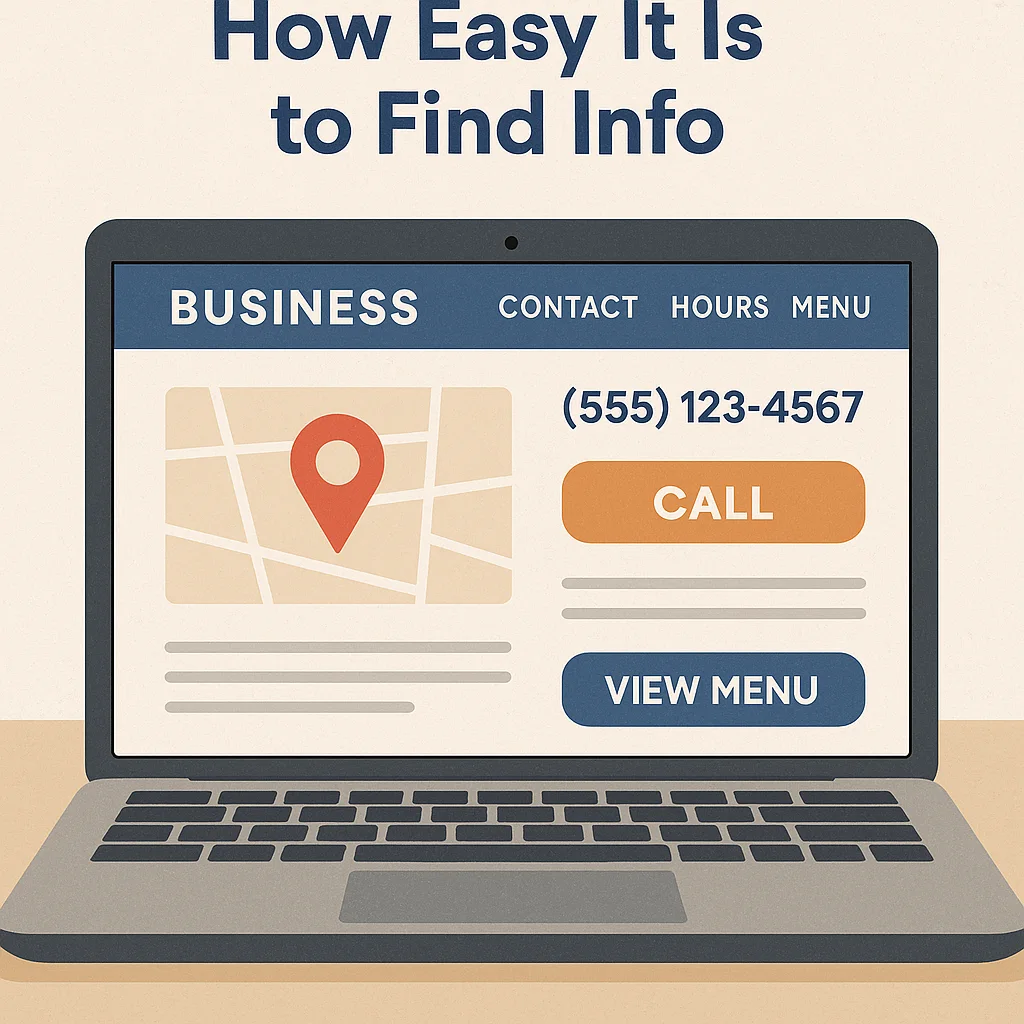
Thing #5: How Easy It Is to Find Info
Here’s the deal: Californians are impatient. Nobody here is digging through six menus just to find your phone number or hours. If your info isn’t front and center, you’ve already lost them.
What People Actually Want Fast
- Your hours (is this place even open right now?)
- Your address (can I get there without circling the block for 20 minutes?)
- Your phone number (yes, people still call—especially older customers)
- Your menu/services (don’t hide this three clicks deep, please)
If those basics aren’t obvious within seconds, visitors click away and never look back.
Think Like a Californian
People here live busy, fast-paced lives. LA traffic, SF tech hustle, San Diego beach vibes—whatever their scene, they don’t want to waste time. Your site should feel like a clear roadmap, not a puzzle.
Examples of Good UX (User Experience)
- Sticky navigation bar with phone and location info.
- “Click-to-call” buttons on mobile (lifesaver).
- Google Maps embedded so nobody gets lost.
- FAQ sections answering common questions upfront.
This isn’t rocket science—it’s just being user-friendly. And in California, where everyone’s got a dozen options at their fingertips, the easiest site usually wins.
⚡ Bottom line: If people can’t find what they need in under 30 seconds, they’ll find it somewhere else.
Thing #6: Reviews and Social Proof
Californians love reviews. Seriously—Yelp, Google Reviews, TripAdvisor, even Instagram comments… people here read them like it’s the morning news. And if your site doesn’t highlight them, you’re missing out on the easiest trust-builder there is.
Why Reviews Matter So Much Here
In a state full of options, reviews are the shortcut to trust. A taco shop with 4.8 stars on Google in LA? Packed every weekend. A spa in San Diego with a few bad Yelp reviews and no response? Empty. People here want reassurance before they spend money.
What Counts as Social Proof
- Google Reviews (the first thing people check after clicking “Directions”).
- Yelp ratings (especially for food, salons, local services).
- Instagram posts & tags (if nobody’s tagging you, do you even exist?).
- Testimonials on your website (real ones, not “John D. says you’re awesome” with no face).
How to Show Reviews on Your Site
- Add a reviews section with star ratings.
- Embed your Google Maps business card.
- Feature Instagram posts from real customers.
- Respond to negative reviews publicly (shows accountability).
Californians don’t expect perfection—they expect honesty. A few bad reviews won’t hurt you, but ignoring them will.
⚡ Bottom line: Reviews are like currency in California. If you’re not showing them off, it’s like hiding your best selling point.
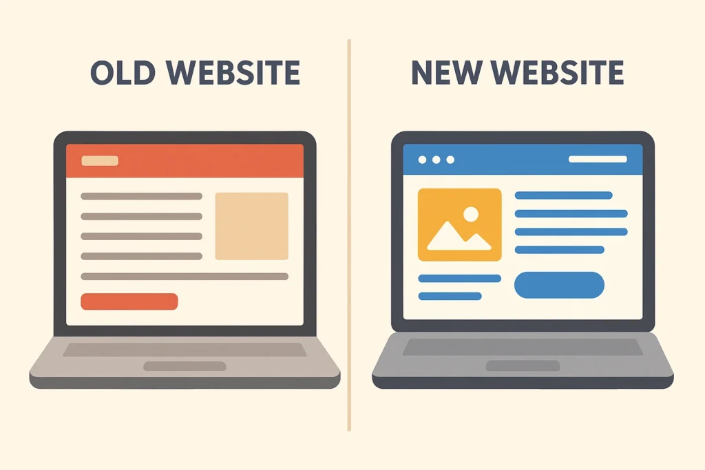
Thing #7: If You Actually Update Your Site
Look, nothing screams “we don’t care” like a website that looks like it’s been frozen in time since 2015. Californians are tech-savvy, trend-aware, and quick to judge. If your site feels outdated, people assume your business is outdated too.
Signs Your Site Feels Old
- Copyright still says 2019 at the bottom.
- Blog posts stopped three years ago.
- Photos that look grainy or clearly from another decade.
- A design that doesn’t fit modern screens or phones.
Why Fresh Content Matters
Californians are surrounded by new everything—new restaurants, new startups, new fashion trends, new apps. If your site looks stale, you’re not part of the conversation. Updating your site—even just with seasonal content, new photos, or blog posts—shows you’re alive and active.
Search Engines Notice Too
It’s not just people. Google actually favors sites that stay updated. If your content hasn’t changed in years, your rankings slip. That’s why part of good California web design is building a site that’s easy to keep fresh.
What to Keep Updated
- Hours and location (especially important for restaurants and local shops).
- Menus, pricing, or service offerings.
- Photos of your business and team.
- Blog posts or news updates (even once a month helps).
⚡ Bottom line: If your site looks abandoned, people will treat your business like it’s abandoned too. Keep it fresh, and Californians will know you’re here to stay.
So, What Do Californians Secretly Judge?
Look, here’s the truth—Californians are picky. Between LA trendsetters, Silicon Valley techies, and San Diego surfers, everyone’s got high standards. And honestly? That’s not a bad thing. It just means if you fix these 7 little details, you’re already ahead of half your competition.
To recap, people here secretly judge:
- How fast your site loads.
- How it looks on a phone.
- Whether your branding feels authentic.
- Your overall visual vibe.
- How easy it is to find info.
- Your reviews and social proof.
- If you actually update your site.
Get those right, and suddenly your website isn’t just “a site.” It’s your 24/7 salesperson, your credibility card, and your best chance to stand out in one of the most competitive states in the country.
So yeah, California web design isn’t just about pretty colors. It’s about respect—for your customers’ time, their tastes, and their expectations. Nail that, and Californians will not only notice—you’ll earn their trust.
❓ FAQs About California Web Design
Do Californians really care about web design that much?
Yep. They’re surrounded by sleek tech and stylish brands every day. A weak site stands out for the wrong reasons.
What’s the #1 mistake businesses make here?
Not thinking mobile-first. Seriously, if your site isn’t smooth on a phone, you’ve already lost.
How often should I update my site in California?
At least a few times a year. New photos, blog posts, or even just refreshing your homepage shows you’re active.
Do reviews really affect web design?
They do. People expect to see reviews featured on your site—it’s part of building instant trust.
Should I hire a local California web design agency?
If your budget allows, yes. Local agencies understand the California vibe and customer expectations better than a random freelancer overseas. (For example, Curtis Design gets how to blend design + SEO for California businesses.)
Is SEO part of web design here?
It should be. A pretty site that nobody finds is useless. Good California web design always bakes in SEO from the start.